 Vol. 4 CONTENTS
Step 8-2. I confirm briefly again the four element and 3 layers.
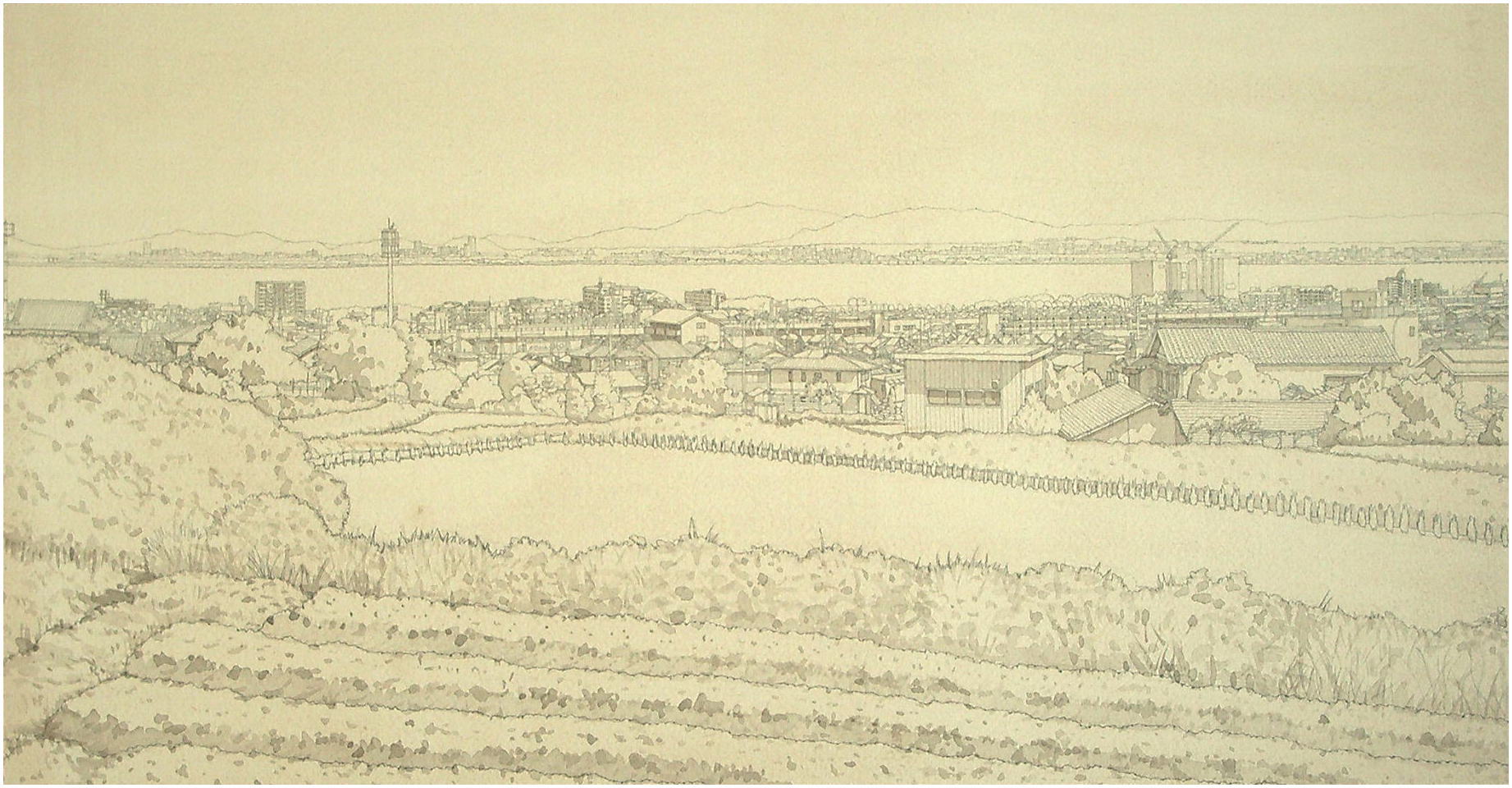
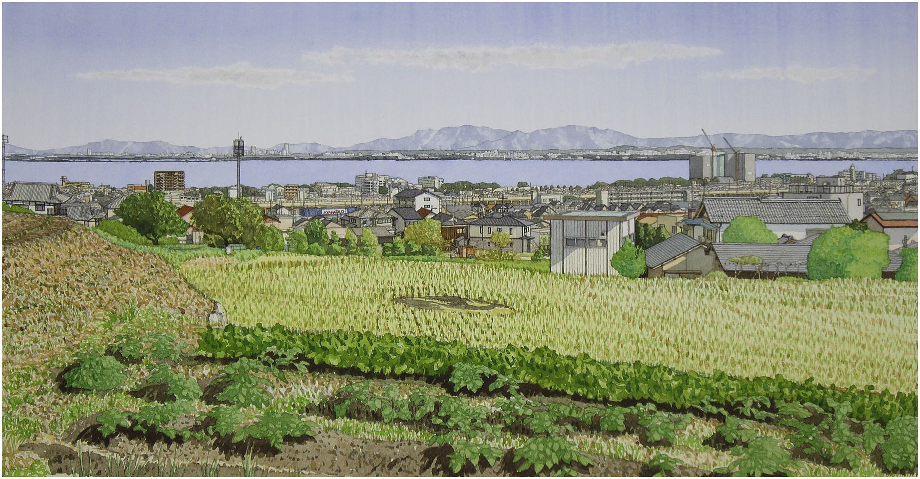
Step 9. Finsh the layer 1=near distance part
Vol. 4 CONTENTS
Step 8-2. I confirm briefly again the four element and 3 layers.
Step 9. Finsh the layer 1=near distance part
Step 9-1. basic thought to depict the layer 1
Step 9-2. landscape painting and layers, and the summary of the steps
Step 9-3. examples and depictions about layer 1
Step 9-3-01. exmples, 3rd element and the expression of the copper
Step 9-3-02. to depict the 3rd and 4th element of sky and mountain and sea
Step 9-3-03. the points to depict sky and sea and mountain
Step 9-3-04. to depict the 3rd and 4th element of the buildings and houses
Step 9-3-05. about the common element of depiction
Step 9-3-06. the 20 examples of depictions of sky
Step 9-3-07. the 17 examples of depictions of sea
Step 9-3-08. the 8 examples of depicitons of mountain
Step 9-3-09. the examples of the depictions of tree
Step 9-3-10. the 12 examples of the depictions of other details
Step 9-3-11. the finish of the sky
Step 10 FINISH
6. PS. The supplementary explain about the documentary process1
Postscrip 2022.03.07

Step 8-2
 confirm briefly again the four element and 3 layers.
I have explained to "how to draw the layer 2"
And I explained that an visual object is determined by the four elements.
1st element= the out-line
2nd element=the mass or details
3rd element=the texture or the condition of surface.
4th element= the color
And I explained that the whole view of landscape is roughly constiuted
by the different three parts, and I named those three parts like below.
Layer 3=far distance
Layer 2=middle distance
Layer 1=near distance
And the relations between each element and each layer are below.
Layer 3 has only one element, 1st element,
or only one element is clearly recognizable
on layer 3.
Layer 2 has two elemnet, 1st and 2nd element,
or two elements are clearly recognizable
on layer 2.
Layer 1 has three element, 1st, 2nd and 3rd
element, or three elements are clearly recognizable
on layer 1.
I showed you my solutions about layer 3 and 2.
about layer 3,
that is,
the object on the layer 3 is similar to our conceptual recognition, namely
it is the object dipicted by the 1st element, the out-line, or the vague
partern by only two or three different value of the brightness about the
same color, like gray violet.
We can't find further elements but the out-line
about layer 3. And we can find there only
conceptual recognition, that is a house,
or that is a car, or that is a tree, etc.
I showed you my solution about the layer
3 like below.
For monochrome watercolor, Landscape in Osaka, I depict the objects by the exact out-line
and shadowing.
For full color watercolor, Landscape in Otsu, I depict the objects by the exact color
out-line and shadowing or vague patern by
a few different value of the brightness.
about layer 2,
that is,
the object on the layer 2 has not only the 1st element but also the 2nd
element, the mass or detail that we can depict enough. We need to depict
here the layer 2 not only 'what it is' but also 'how it is' is important
.
I showed you my solution about the layer 2 like below.
For Landscape in Osaka, I depict the dimensions of an object and
its details by the contuor line and the shadowing
and wash.
For Landscape in Otsu, I depict the dimensions of an object and
its details by the color contuor line and
the shadowing and color hatchings.

Step 9
 insh the layer 1=near distance part
Then, how should we draw the layer 1?
Basically, the depiction is not so different
from the layer 2 as the difference between
the layer 3 and layer 2.
I have explained how to measure an object
and you can now exactly draw an object by
my method, not only the dimensions but also
the details.
Generally, if you have drawn your landscape
exactly keeping the ratio of each part, then
the landscape will be appear realistic only
adding the shadowing like my works, Landscape
in Osaka. Because we usually recognize only
the concepts about the painting as well as
real view.
Indeed the objects so far as on middle distance
has enough the density of dipiction only
by the contuor line, but the objects on near
distance can keep no loger enough the density,
because the object itself becomes bigger
than the other objects, and the space surrounded
by the contuor line appears vacant without
the depiction of inner part by that texture
or condition of surface.
Step 9-1. basic thought to depict the layer 1
So, for the layer 1, it is important to dipict the 3rd element, that texture
or condition of surface. That is not so important as a Still-life, but
you need to remember that. For Still-life motive has a few details that
we can sufficiently express only by the contuor line. If it hasn't the
depiction of inner part by that texture or conditon of surface, there remains
big empty space that never appears realistic, however very bold expression
as a modern art. fig 47, fig 48
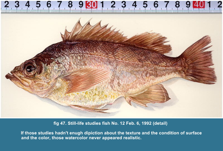
Usually we aren't carefully observing the 3rd element, the texture and the condition of surface and the 4th element, the color of the details.
About the 3rd and 4th elements, the difference between our sight and a
photo is clearly coming out. As I have explained, we think we have an image
on our brain by compounding the images, so we can have the proper-colored
dark part and light part at the same time. A film only can adapt the proper-exposure
either to dark part or light part, so the dark part of the photo is sometime
black out or the light part is white out, when there coexist the lighter
part and darker part.
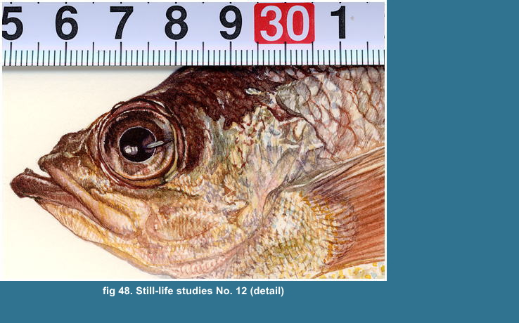
About a glossy motive, like the wet fish skin fig 48 or a refrecting motive,
like a dimand, the same phenomena are seen.
As our brain makes the plural images totally
compounded to an image, I think the image
has much more richer details than a photo,
monotonus, one point of view.
But I suppose we aren't usually aware of
such the richer details. Because we do with
only "what it is" and do without
"how it is". We don't see though
we are seeing.
When we paint, the problem about our recognition
appears clearly.
For landscape painting, we don't have such
tangible details as the Still-life motive,
but you will need to dipict the details more
or less to get the sufficient density of
depiction to the other part.
Why do I show you my Still-life studies?
If you had seen an illustrated book of fishes,
you knew what kind of a picture those illustrations
are. Those illustration are never realistic
expression and those are far from our actual
impression. The main job of those illustration
is to explain the chracteristic appearance
of a fish. Howevr the illustration is depicted
with the exact number of scales, the number
was exact, but those never really appeared
so. Those illustration is rather cartoon
than realist expression.
See fig 47, 48
I can see some scales and I can't see some
of them by the lighting condition, though
I can count its, if I do it. The glossy wet
fish skin reflects marvellously various kinds
of colors. That is much more important element
of the picture as a realism than to explain
the number of scales or a rather idealistic
or typical or analogical colors of the fish.
If you can't see the low of scales in natural
eye position, then you must never depict
its, however you can see and understand its
by closely examination or by another eye
postion or by counting its with a pincette.
Because then you depict what you didn't see,
is never realism. You can depict its for
your understanding, unless the depiction
changes definitely the natural impression,
is the exception.
Namely, for the Still-life, you can understand
the shapes as what it is, are the out-line,
eye, mouth, mandible, gill cover, fins and
spiny rays, lateral line and some of scales.
Those are depictable by contuor line. And
you can understand the general color.
But you can never express realistically the
fish only with that element. But there yet
remain the other shapeless colors pattern
and the light and shade that fill up almost
the whole arear except above mentioned contuor
line.
Those shapeless colors pattern and the distribution
of the light and shade are itselves meaningless
not like the functional shape, eye, mouth,
fins, etc. And that "being meaningless"
make us difficult to understand and memorize
that shape and how to express its.
And we don't usually be care about such the meaningless and random shapes,
that are the accidental existence. However we can look out the general
tendancy about that shapeless pattern, to get that tendacy is the conceputual
understanding, and that the application for a painting is only useful for
the explanational picture, never get a realism expression.
And that "being meaningless and radom"
colors pattern and the light and shade, the
accidental existence is much more important
element and the life of an art.
A realism painting is neither to get the
analogical understanding nor to judge the
usefulness.
To be faithful to the object, however it is a meaningless or a random,
or an accidental existence, is the most important atitude for a realism
painting and I don't know much more suitable another words than that.
We never say "it 's meaningless, so I don't paint it"
Those are beyond our usual visual recognition.
Then we must proceed our depiction one part
by one part with observing and depicting
and checking the depicted part whether it
appears as the same as what we saw and we
didn't depict what we didn't see.
We are sometimes, very sometimes apt to depict what we didn't see and depict
what we already knew. That isn't important at all as a picture, but we
can never get a realism painting by that. We must surely know the end and
the means.
How to understand a random?
Any way, to memorize and reproduce a random
as it is, is difficult. But there is a practical
way that we may replace it, part by part
approximately by the regular shape, like
a circle, rectangle, triangle. That is well
know method.
Those replacements make us much more easier understood a ramdom
by the division to the samller regular shapes. Then you can much more easily correct the smaller regular shapes to the natural, irregular shapes.
Those are the basic Thought about Depiction.
I think my explanation about Depiction has
been rather Thought than a Prescription.
I can explaine a particular method to measure
exactly a shape. But my explanation about
the Depiction is vague, just basic thought,
I think too.
But a particular Depiction belongs to a particular object. A Still-life
is very clear about that point of view that we may only depict as what
it is, I may not mention about the distance between our eyes and the motive,
and I may only explaine about each motive how to depict it.
But a Landscape painting contains so many
kinds of objects in itself. And we have to
see those various kinds of objects in a Perspective,
in a particular distance, makes those object
declaired to be depicted by a particular
depiction as a Landscape painting.
Those distances between me and the objects
give the variation to "how does it appear"
So I categorized the objects with three kinds
of layer that the objects belong to by its
distance.

Step 9-2
 andscape painting and layers, and the summary of the steps until
here
andscape painting and layers, and the summary of the steps until
here
My categorization is very practical. It is practically uncorrect idea,
however the idea is right, that the distance between you and an object
is continuously changing, so you suppose you can continuously see them
all.
We will have a paticular view by our stance. And that is,
If you stand on the top of a mountain, layer 3 is dominant on the view.
If you sit on a hill, layer 2 is dominant.
If you are on the street, layer 1 is dominant.
The objects on other layer are seen just like filling up the remained samller space.
And the objects on each layer are sufficiently depictable by these elemnts
below. I mention its again.
1. the objects on layer 3 are by out-line,
1st element, and rough rather monotone shadowing.
2. the objects on layer 2 are by out-line
and mass or details, 1st and 2nd element
and coloring & shadowing
3. the objects on layer 1 are by out-line,
mass or details and the texture or condition
of surface, 1st, 2nd and 3rd element, and
coloring & shadowing
And the depiction about the objects on layer
3 and 2 are, roughly say it, similar to our
usual recoginition about visual, becasue
I think we usually recognize only the 1st
and 2nd element. But we usually do without
the 3rd element. if we recognize it, indeed
that is very rough, I suppose.
So you need to be aware of the 3rd element,
when you depict layer 1.
The summary of the whole process are below.
01. Determination of the framing
02. Confirmation of the Horizontal and Vertical
line
03. Determination of the whole lay-out
04. Measurement of the objects on layer 2
05. Measurement of the objects on layer 1
06. Measurement and Depiction of the objects
on layer 3
07. Depiction of the objects on layer 2
08. Depiction of the objects on layer 1
09. Depiction of the sky and the sea and the mountain that occupys the large arear.
10. Finish
I think I have explained sufficently the
articles 01 to 07 and did the basic thought
about 08. There only remains to explaine
the articles 09 and 10.
I need to explaine much more definitely with
the examples about the 3rd element relating
to the article 09. I am going to explaine
the article 08 and 09 by one instance by
one and end the explanation.
The depiction of sky and sea and mountain
and a tree are resemble to depict the 3rd
element, so I am going to do its here.

Step 9-3
 xamples and depictions about layer 1
Step 9-3-01. exmples, 3rd element and the expression of the copper engravings
I show you some examples below to explain the 3rd element, namely the texture
or the conditon of surface. I think those examples well show you what I
means the 3rd element.
As I have mentioned, the 3rd element and 2nd element supplement each other.
Namely the depiction of the texture give us much more the tangible image
about the cubic, mass as you see the examples after. And the depiction
of the texture or the condition of surface can't be expressed neglecting
the expression of the cubic or mass or detail, 2nd element.
A copper engraving has a fewer expression to depict. I has to depict everything
only by lines and dots, that makes us much more clearly the meanings of
2nd and 3rd elemnt, I think.
When I had started to engrave Landscape in Osaka, I was clearly aware of the problem about the density of depiction.
That problem is much more serious for a Copper Engraving than a Watercolor.
Because I can use only three kinds of line, light, middle, heavy and a
dot and only one color, black to depict the whole parts of landscape. For
a Watercolor, you can use various width of brush and touch, those seem
almost infinitive freely choice comparing to the copper engraving.
For a Copper Engraving, you can't easily
darken any part by the wash like a Watercolor.
You have to endevour to engrave one line
by one line to darken that part by hatchings.
At the same time, the hatchings have to make
us feel the cubic impression and the tangible
quality of the object, 3rd element.
By the way, the engraving method to express the cubic or 3 dimentional
impression or volume had been very deteminedly and systematically established
by Hendrick Goltius(1558-1617) with closs-hatching along the solid and
dot. That is a typical or stereotype technique for well known bank note
images, is rather the depiction of an artisan than that of an artist. And
that typical technique is usually to damage the 3rd element.
(Unfotunately, I don't know his works except
his engraving and a few drawing. I know one
his brilliant drawing, Portrait of Ginbanni
Bologna, 370x299mm, 1591, Teylers Museum,
Haarlem. I have a book, The Age of Bruegel,
Cambridge Univ. Press 1986. The drawing is
appeared on the book. The realistic depiction
concentrated on the appearance of sitter
is marvellous.)
But I have a lots of things to learn by him
and especially by Durer's works.
As a result that limitation about expression
made me choiced the color hatchings to depict
the 3rd element of the object for a Watercolor
Landscape.
I intended to express much more definitely and clearly the images for a
Watercolor since I had started the Copper Engraving.
And I have been hasting to finish my Watecolor
in, I think, the limited short time. And
that make my Watercolor much more strongly
styilized about that expression than as a
natural expression or realistic expression.
You may understand by my Still-life studies that I can expresss realistically.
For the Still-life, I have enough time to depict, because the area that
I have to paint is smaller than the Landscape, and the lighting condition is always same.
I had neither enough time nor freedom nor money, nothing I haven't, but only my volition.
And I think I have now lost interest in that expression. I think I need a change. I have to change.
Surely I think my expression has changed to the worse direction. But I can only proceed one step by one step.
So, to show these expamles is not so meaningless.
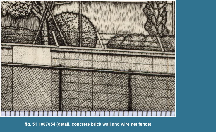
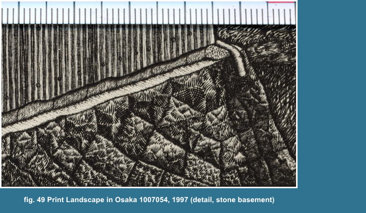
fig 51.
I engraved here the lines of the wire net fence after I have finished the concrete block wall.
I depicted the stained block face one by one with circles by dots.
So the overlapped wall part by the wire fence is less effective than my laborious work.
But there are the depicted parts under the wire net fence. Can you see
it?
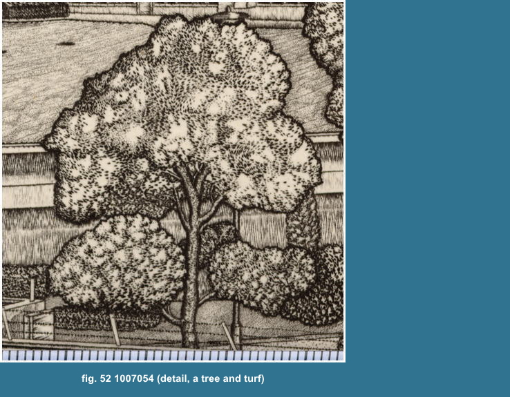
fig 52.
I depicted here almost every thing with short, very short lines and dots.
The contuor lines and the tone that you can see here, fig 51 are consisted
by the numberless short lines, about 0.3mm long. I engraved probably 15
to 30 lines between one millmetre. So you can't see each one line or a
dot by that magnification, x3. You can see the scale on bottom. Each division
is one millimetre. Durer is genius, but even he didn't engrave like me,
perhaps. I think I may be proud of only that. Probably no one is there
who endevoured to engrave as me.
If you engrave 15 short lines between one
millimetre and 3 short lines at each one
second, then you can only engrave one line,
one millimeter long for five seconds, 12mm
long for one minute, 120mm long for 10 minutes.
This is such working.
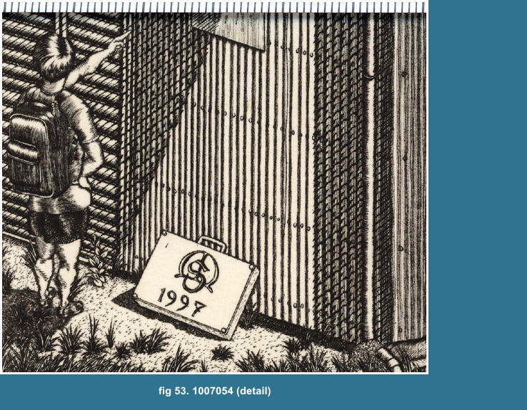
the corrugated zinc sheet and the shutter are engraved with rather the
heavy diagonal hatching line crossing the parallel lines.
I suppose you can't see the expression about the grass, that was depicted
by the contour line and the very short lines covering normally the contour
lines.
So the contour lines make you felt the contour lines 'soft' impression.
The man in this picture is myself, that is the Durer like expression. I
used to go sketching like that costume and bag on the shoulder and my watercolor
carring case with hand, bearing my mongrame MS and date, 1997.

Step 9-3-02
 o depict the 3rd and 4th element of sky and mountain and sea
I know you will ask me, "why do the sky and mountain and sea have 3rd or 4th element? you said 3rd and 4th element belongs to the layer 1=near distance".
Of course those are belong to layer 2= middle distance or layer 3=far distance.
And the sky is only the layer of the air and the clouds, the groupe of
the very small particles of water. I know it too that I can't feel the
touching.
But these has the nature, a big expansion.
A mountain is the gathering of trees and the basement, raised part of earth.
But it is the same thing as the sky and sea, unles you step into the mountain.
Those usually occupy the large part of the picture, so if you have precisely
depicted the other objects, you need to depict the sky and mountain and
sea for the same density of the depiction as the objects. Or you can remain
it completely blank too, and it is better than you do it roughly. For,
if you have done realistically the other objects, at least the blank part
won't damage the other objects. And such picture often gives us a particular
artistic impression.
Any way, the sky has nothing in their inner part of the contour line, precisely
say it, the boundary line, so to depict the inner part is completely same
as to depict, former mentioned, the skin of fish.
The 3rd element of sky is how to depict the contrast between the vacant
space and the various cloud, volumious, heavy, etc. floating, moving, fast
or slow, in the sky.
And the 3rd element of mountain in middle distance is how to depict the
undulation of surface and the distribution of the trees.
And the 3rd element of sea is how to depict the receding plain, rippling,
waving by winds, reflecting light and shadow like fragments of diamond.
I say it again, those are the same as to depict the skin of fish.
Namely, if you can't understand those as the cubic, spacific expansion
with tangible qualities, you need to see them as a random patern as the
skin of fish that is projected to a plain.
However you see it as a random patern on a plain, as far as you depict
faithfully one by one, as a result, you will success to express the spacific
nature, I think. For, more or less a painting is the projection to a plain,
and as I mentioned, a knowledge is often the obstacle to see how it is,
so it may be better, if you can see faithfully what you are seeing.
A building and house usually have a lots of the details, so those may give
not so vacant impression without the depiction of 3rd element, but you
can't do without depicting the 3rd or 4th element of sky and sea and mountain
and tree, because those usually haven't definite detail depicted by contuor
line for their large space in the picture.
Step 9-3-03. the points to depict sky and sea and mountain
The point of view is below.
Sky and sea and mountain are much more changable
by the condition of weather, so the impressions
are categorize below.
1. about Sky
1-1. Lucid fine without clouds
1-2. Lucid fine with clouds
1-3. Fine but humid or not transparent atomsphere
without clouds
1-4. Fine but humid or not transparent atomosphere
with clouds
1-5. Cloudy
2. about Sea
2-1. strong wind under the 5 kinds of sky
2-2. breeze under the 5 kinds of sky
2-3. no winds under the 5 kinds of sky
the color of the sea
If it is fine, then the sea reflects the blue sky, the color is indigo
or ultra marine blue, or the white of the clouds.
If it is cloudy, then the color is the sea
itself, like Canaletto blue and the grey
of clouds.
Each one of wave has two sides, a plain reflecting light and a plain transmitting
light.
The reflecting plain is the color of the sky, and the transmitting plain is the color of the sea.
And you can see the two side for near, and
only one side for middle to far and the one
side is the reflecting plain.
the size of wave
The size of each wave is so changeable and
various by the winds.
The shapes of reflection depend on the size of waves, and the size depends on the winds.
The weaker winds or breeze rises the slow
moving and gentle curvature of waves, and
the waves transform variously the reflections
on the waves into an attractive and abstractive
shapes, that's marvellous.
A strong winds rise rather regular waving,
that reflects constantly briliant light,
but hasn't above mentioned attractive reflections.
3. about Mountain
Clouds cast the shadows on the mountain, then you need to be careful to
distinguish whether the shadows are by the coulds or the mountains itself
shape. So the impression on the mountain under the fine sky, 1-2 or 1-4
is very changable. The clouds pass quickly.
And the shadows are quickly changing by the
position of sun, then you need to remember
the position or the time, or you will be
shadowing at random that only confuses the
reasonable and cubic impression of the mountain.
If it is fine, the color of the mountain
is generally changing from the color of the
mountain itself, i.e. green to the violet
grey according to the distance, near to far
distance.
By the way, I think the color of the Fresh
green like in May is much more impressive
in cloudy day than in fine day. This is quite
difficult problem for me which condition
I should choice.
4. about tree
We can never neither distiguish one leaf
by one leaf nor depict the whole tree with
one leaf by one leaf, even if the tree stands
near us.
If you paint only a tree, then you may depict partially with one leaf by one leaf.
You should paint one leaf by one leaf, if you can reallly distiguish its.
But It is absurd and contradiction that you paint one leaf by one leaf
that you couldn't really distiguish, unless you intend any stylization.
But trees in Landscape are naturally standing
on the middle distance or far, then you can
never do that.
Then I think you need to understand the gathering of the leaves as a texture,
or a random pattern by the colors or the tones covering the whole surface
of the tree as well as sky.
And the depiction of texture has to indicate the cubic impression. fig 52.
Step 9-3-03-01. my favourite sky
That is the fine sky just before the day,
a typhoon comming. The blue of the sky is,
as I know, the most bright and transparent
and the clouds are very solid and bulky and
very white, coming and passing one after
another. As it is the great band of the flow
of the air high above the ground in unusual
high velocity and the clouds just upon the
ground drugged by that flowing.
Step 9-3-04. to depict the 3rd and 4th element of the buildings and houses
and others
To depict those things isn't difficult, if you can do previous steps. What
we, human beings have maden is easy to understand and easy to painting
as well. However those stand near by you, you don't need the skill to depict
a fish. And those are never changing its shape, except the color and shadows
that also change its color by the weather condition, but it's not so difficult
as to depict sky and mountain and sea.
The shape is simple and regular. So I have
to say nothing but show later a few example.
This is quite brief and simple explain, but you can do it easily, if you
can do previous steps, I think it no doubt.
Step 9-3-05. about the common element of depiction
What you have to do under the recognition about those conditions, is the
shadowing, and that is to understand the mass and cubic shape and to depict
the undulation of the surface with 3rd element, tangible quaity, texture
or the condition of surface.
Those knowledges aren't for the purpose 'How do you
express with its?' but 'Which element you should carefully examine, How should you
look with its?'
And there are various ways to depict that texture, those are better to
show you some examples than to explain.

Step 9-3-06
he 20 examples of depictions of sky
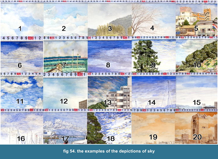
01. Landscape in Kyoto No. 3 Aug. 9, 1989 // natural expression, wash
02. Landscape in Kyoto No. 4 Aug. 29, 1989 // natural expression, wash
03. Landscape in Kyoto No. 6 Oct.2, 1989 // natural expression, wash
04. Landscape in Kyoto No. 8 Apr. 1,1990 // natural expression, wash
05. Landscape in Otsu No. 7 Jul. 4, 1998 // stylized expression, wash
06. Landscape in Otsu No. 8 Aug. 8, 1998 // stylized expression, wash & pen
07. Landscape in Otsu No. 9 Sep. 13, 1998 // stylized expression, wash
08. Landscape in Otsu No. 10 Oct. 25, 1998 // stylized expression, wash & pen
09. Landscape in Otsu No. 11 May 31, 1999 // stylized expression, pen
10. Landscape in Otsu No. 12 Jul. 31, 1999 // stylized expression, wash & pen
11. Landscape in Otsu No. 13 Aug. 29, 1999 // strongly stylized expression, pen
12. Landscape in Otsu No. 14 Oct. 11, 1999 // stylized expresion, wash
13. Landscape in Otsu No. 16 Jul. 30, 2000 // strongly stylized expression, brush
14. Landscape in Otsu No. 19 Oct. 22, 2000 // stylized expression, brush
15. Landscape in Otsu No. 20 Jul. 14, 2001 // stylized expression, wash
16. Landscape in Otsu No. 21 Jul. 29, 2001 // stylized expression, brush
17. Landscape in Otsu No. 22 Aug. 15, 2001 // stylized expression, brush
18. Landscape in Otsu No. 24 Oct. 20, 2001 // strongly stylized expression, brush
19. Landscape in Osaka No. 1 Oct. 18, 1992 // natural expression, wash & pen
20. Landscape in Osaka No. 5 Aug. 23, 1993 // natural expression, wash
Step 9-3-06-01. General tendancy about the depictions of sky
I depicted naturally the sky for Landscape
in Kyoto. ( No. 1 - No. 4 )
Because as I had just started A Landscpe painting and it was the first
time, I had a fresh eye and feeling about landscape.
I have enough time in 1989, March to Octobar I was painting everyday, to paint and I could wait a day or two only to finish the fine blue sky. That reflects the faithful expressions.
I depicted stylistically the sky for Landscape
in Otsu. ( No. 5 - No. 18 )
Because then my main work had been shifted
to A Copper Engraving and I didn't have enough
time. I could no longer wait only for the
fine blue sky. That influenced the depiction
with the frequent using of hatchings and
the stylized expression.
When I am seeing the fine, very deep blue
sky, I feel I cannot help painting the sky
with much more stronger, deeper and determined
blue and paint it out by that blue, but it
is dangerous temptation, rather I should
be objectively observing. Still I think I
can understand Gogh's feeling about "Wheat
field with crows" And I suppose everyone
has once felt it, probably.
Any way, for a watercolor, as I mentioned,
if you paint out the sky with the blue of
high chroma, then the sky will be very dark.
So the depiction of sky by brush or pen in
later works is my solution to get much more
higher chroma blue sky and at the same time
avoid the sky to be too much darken. I might
get it by the stylized expression instead
of a realistic, or natural expression. I
think I should get it back or seek another
way.
Generally, I used mainly French Ultramarine
and Manganese Blue as bule for Landscape
in kyoto, Parmanent Blue or Cobalt Blue and
Cerulean Blue for Landscape in Otsu. Manganese
Blue is excellent, but Cerulean Blue isn't,
for it darken the picture.

Step 9-3-07
he 17 examples of depictions of sea
21. Landscape in Kyoto No. 2 Jul. 21, 1989 // natural expression, wash & brush
22. Landscape in Kyoto No. 12 Jul. 8, 1990 // natural expression, wash & brush
23. Landscape in Kyoto No. 21 Jul. 19, 1991 // natural expression, wash & brush
24. Landscape in Otsu No. 10 Oct. 10,1990 // natural expression, wash & brush
25. Landscape in Otsu No. 7 Jul. 4, 1998 // stylized expression, wash & brush
26. Landscape in Otsu No. 8 Aug. 8, 1998 // stylized expression, brush
27. Landscape in Otsu No. 8 Aug. 8, 1998 // stylized expression, brush & pen
28. Landscape in Otsu No. 9 Sep. 13, 1998 // stylized expression, brush
29. Landscape in Otsu No. 10 Oct. 25, 1999 // stylized expression, brush & pen
30. Landscape in Otsu No. 13 Aug. 29, 1999// strongly stylized expression,
brush & pen
31. Landscape in Otsu No. 13 Aug. 29, 1999// strongly stylized expression, brush & pen
32. Landscape in Otsu No. 17 Aug. 16, 2000// strongly stylized expresion,
brush & pen
33. Landscape in Otsu No. 17 Aug. 16, 2000// strongly stylized expression,
brush & pen
34. Landscape in Otsu No. 19 Oct. 22, 2000 // stylized expression, brush
35. Landscape in Otsu No. 21 Jul. 29, 2001 // strongly stylized expression, brush
36. Landscape in Otsu No. 22 Aug. 15, 2001 // strongly stylized expression, brush
37. Landscape in Otsu No. 23 Sep. 15, 2001 // strongly stylized expression, brush
Step 9-3-07-01. General tendancy about the depictions of sea
The works of Landscape in kyoto are natural
expression and the works of Landscape in
Otsu are stylized expression by the same
reason that I mentioned on the depiction
of sky.
To depict the wave of river is much more
easier than to do the wave of lake.
If you were carefully observing the flow
of river, you might see the same wave was
repeating at particular interval. But the
movings of the wave of lake are far complicated
by the interference between waves and the
winds. It is impossible to find out the exact
pattern of waving except very rough one,
I think. And the waves reflect the sky, so
the color patterns are very changeable and
complicated. But its are so attractive and
worth endevouring to get its.
The color patterns are the result of the waves, the undulation of its surface.
Even I know it, but I sometimes forget the waves itselves, rise and fall,
for being busy to get the mavellous color patterns. I think I didn't have
strong volition to exactly depict it, or realisticall.
I can suppose the dimension of each wave
is naturally changing along the distance.
But you, as well as I, can't acturally see
it clearly in the field. But it's not useless
to understand idealistically the nature to
get the dimension of a wave in particular
distance.
Step 9-3-07-02. about the depiction of the waves in far distance
The far distant waves can be easily depicted, I think. If it is fine and
windy, then the waves are reflecting the light like the fragments of diamond
and the waves are the collection of the small fragments of bright Indigo.
If it's fine, but not windy, then the waves are the smooth band of blue.
Step 9-3-07-03. about the depiction of the waves in middle distance
The dimension of each wave is naturally bigger than that in far, so the
shape has clearly the character. The color of the waves are not the colloction
of the single color, indigo. Though the size of the wave is still small,
but the wave has clearly two plains, the wave that reflects the light and
the plain that transmits the light or the waves can be clearly categorized
for two kinds, the wave that reflects the light and the wave that transmits
the light, and that make us feel, roughly saying, the two sort of color,
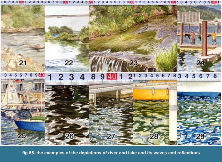
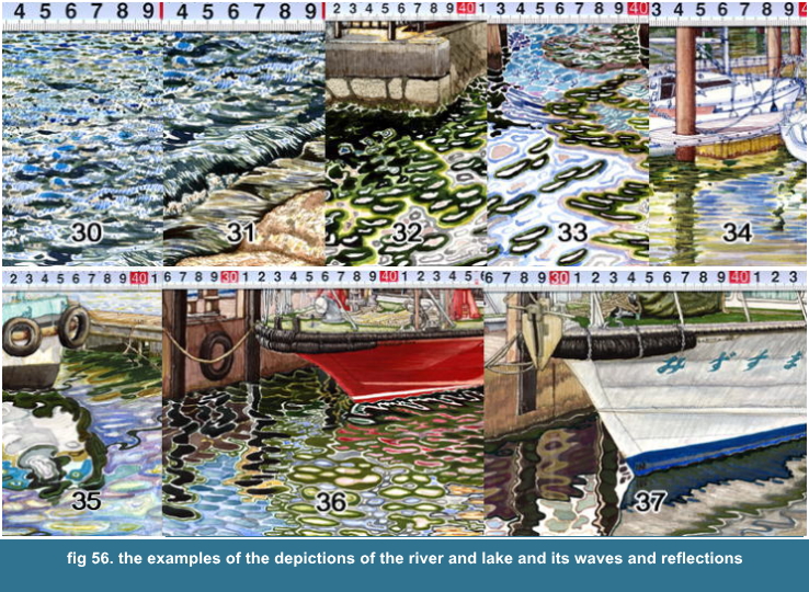
the Indigo and dark Olive Green or Oxide Of Chromium. fig 55-27, fig 56-30
If you want the bright waves reflecting the light, then you had better
to remain the material white of paper for the edge of the wave, the white
keep the watercolor bright and gives the sharp and clear impression. fig
57-27 If you want to reduce that sharp impression, then you can use "wash".
But you can never choice the reversed order,
because you can never get brighter you watercolor,
even you can do it darker.
Step 9-3-07-04. about the depiction of the waves in near distance
When you paint the scenes of waterside, to depict that waves and reflections will be most important subject.
It's is really delightful thing. The waves and winds transform variously the reflections. fig 55-26, 28, 29, fig 56-32-35
When it is white clouds and blue sky, the waves reflect its and transform
its, the effect is marvellous. As the sun position changes the reflection,
you need to be careful which lighting condition you should have. fig 58-33
Especially for the near to middle, the sun position quite changes the impression
of the sea. The waves well reflect the sky.
If it is the windy, fine blue sky with clouds, the impression of the sea is generally composed
by the mingled fragments, the white of clouds, the blue of the sky and the green of the water.
So if it is the windy, fine blue sky without clouds, then the impression
of the sea is deep brilliant blue, Indigo, Parmanent Blue and Cobalt Blue,
it is wonderful, but rather monotone in blue, and it's never be high contrast
as the fine blue sky with clouds, I think.
But the windy, fine blue sky with white,
very white clouds will be quickly changing
by my experience, and it never often comes
again. And the waves are very complicated.
So you must quickly paint its, but it's quite
difficult. You must quickly fix the impression
and remember the weather condition and the
time for next coming.
The scene of nearest waterside is the gallery of the abstract figures.
The breeze is better, for winds ripple the surface, that breaks the reflections
for fragments that are rather monotonous. The gentle and slow moving waves
without winds veriously stretch, shorten, twist and distort the reflections.
fig 58-35, fig 59-36,37

Step 9-3-08
he 8 examples of depicitons of mountain
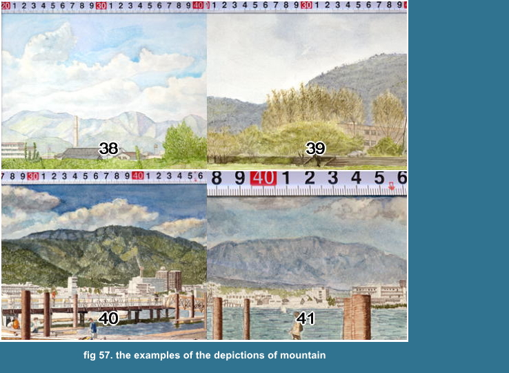
38. Landscape in Kyoto No. 4 Aug. 29, 1989 // natural expression, wash
39. Landscape in Kyoto No. 6 Oct. 2, 1990 // natural expression, wash & brush
40. Landscape in Otsu No. 10 Oct. 10, 1990 // natural expression, wash & brush
41. Landscape in Otsu No. 10 Oct. 10,1990 // natural expression, wash & brush
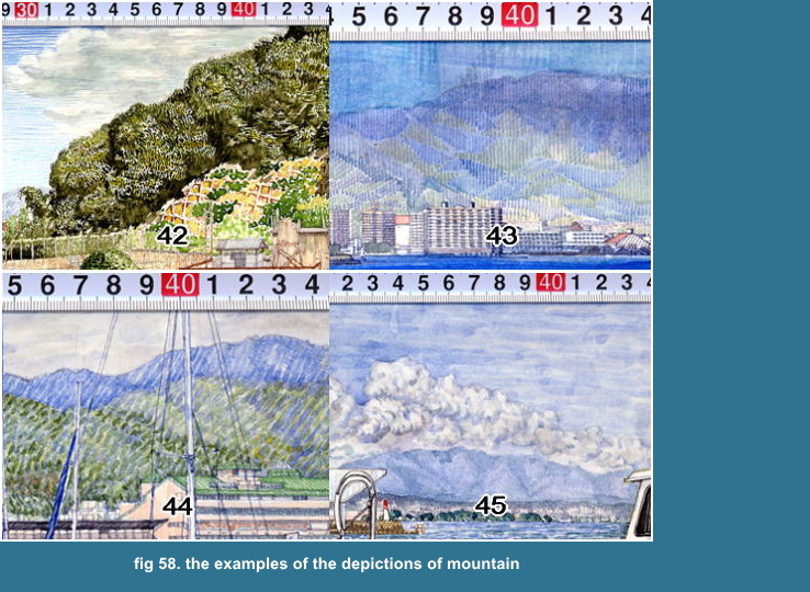
42. Landscape in Otsu No. 12 Jul. 31, 1999 // strongly stylized expression, brush
43. Landscape in Otsu No. 18 Sep 3, 2000// stylized expression, wash & pen
44. Landscape in Otsu No. 19 Oct. 22, 200 // stylized expression, brush
45. Landscape in Otsu No. 22 Aug 15, 2001// stylized expression, wash & pen
Step 9-3-08-01. General tendancy about the depiction of mountain
38 and 39 are natural, 40 and 41 are rather
natural, but 42, 43 and 44 are stylized expression
by the same reason of the former examples.
Step 9-3-08-02. about the depiction of the mountain in far distance
It is important to depict separtedly each
side, light and shade to make feel the solidity
of mountain, except the far mountain that
we can't see any solidity.
Step 9-3-08-02-1. the depiction by wash
38 is the depiction by wash, very naive, but very neat and has sharp edge
and clear expression. You can't see there any touch. I think I had probably
had three hours only to depict it. You may see it as simple technique,
and it probably appears never skillful, but I think you need skill and
speed and exact procedure.
Step 9-3-08-02-2. the depiction by wash and pen
I think it is one of reasonable solution for the detailed landscape painting
to depict the mountain in far distance by wash & pen, like fig 58-43.
That being a stylized expression, you can finish much more easily and quickly.
Firstly, you depict its by hatings only with pen, if you want it much more darken or high contrast,
then you may use "wash". It is most convenient point that by this method, you won't completely damage your painting.
Generally speaking, you need to unify the depiction wholely about your
work, and the depcition by hatchings is suitable for a detailed painting
with pen like my works. fig 58-43 Because it gives the same density of
depiction for every parts. If you depict it only by "wash" and
that size is enough big, then you will feel the vacant impression or the
flatness about that mountain comparing with other detailed parts. That
mountain is in very far, and you don't need anything but very faint image,
then it is an exception, you should do it by "wash".
I can use "brush touches" to depict the mountain. fig 58-44
But I think those rather rough touches may be used for the composition that the near view is dominant.
Because then each object in near distance
is usually enough big to the touches or has
enough details that make us feel the strong
impression even to the touches.
But those touches are too artificial.
Step 9-3-08-03. about the depiction of mountain in middle distance
You can see enough details about the mountain in middle distance. fig 58-42
You can see each tree on the mountain, if you use a binoculars. I think
it is never completely impossible to depict faithfully one tree by one
tree, but almost impossible or it needs too much, too much labour for a
small watercolor. Indeed, I think it is the worth of trying.
You may not depict each tree on the mountain, but the tangible quality,
the condition of surface and at the same time that depiction has to eloquently express the solidity of the mountain.
At least you need to make us feel the hump and bump on the mountain by
a tree's or a groupe of trees' leaves.
I express the same groupe of trees by the short brush lines continuously
drawn in the same direction or along the same curve like the contuor lines
on map and do the other groupe by the short brush lines in another direction
or along the another curve. To use the different direction of lines or
curve, you can distinguish one groupe from the others, and you can express
the solidity or the undulation of the whole mountain like a solid wire
frame of computur graphic. fig 52
Needles to say, these systematic depiction has to be faithful to the observation.
Step 9-3-08-04. about the depiction of mountain in near distance
This is no other than to depict a tree, so I will mention it later.

Step 9-3-09
he 10 examples of the depictions of tree
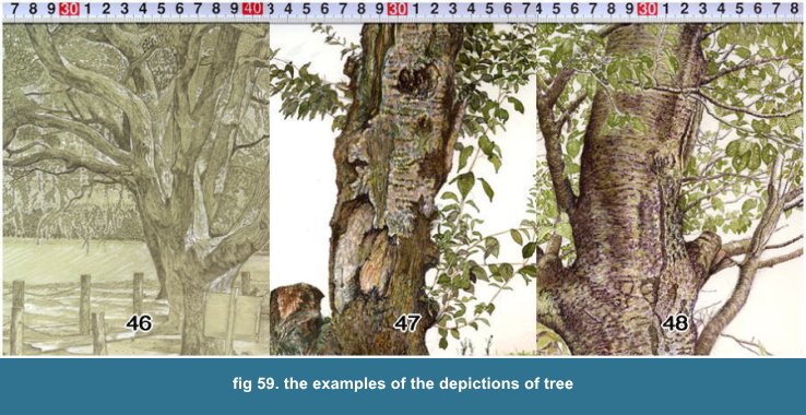
46. Landscape in Kyoto No. 7 Oct. 31, 1989 // natural & stylized expression,
pencil & tempera white
47. Landscape in Kyoto No. 22 Aug. 3, 1991 // natural expression, brush
48. Landscape in Kyoto No. 23 Sep. 4, 1991 // natural expression, brush
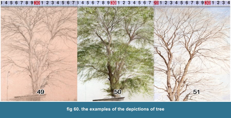
49. Drawing Landscape in Kyoto No. 1 Apr. 16 1989 // natural expression, pencil
50. Landscape in Kyoto No. 1 May 15, 1989 // natural expression, brush, scraping & tempera white
51. Landscape in Kyoto No. 8 Apr. 1, 1990 // natural expression, brush
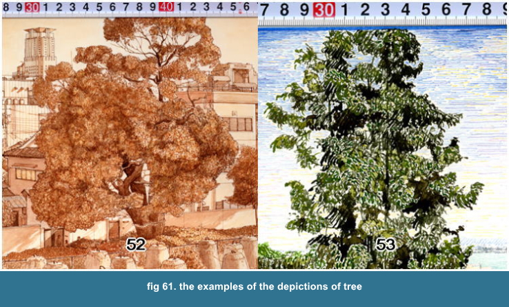
52. Landscape in Osaka No. 9 Jun. 6, 1994 // natural expression, wash &
brush & pen
53. Landscape in Otsu No. 11 May 31, 1999 // strongly stylized expression, brush
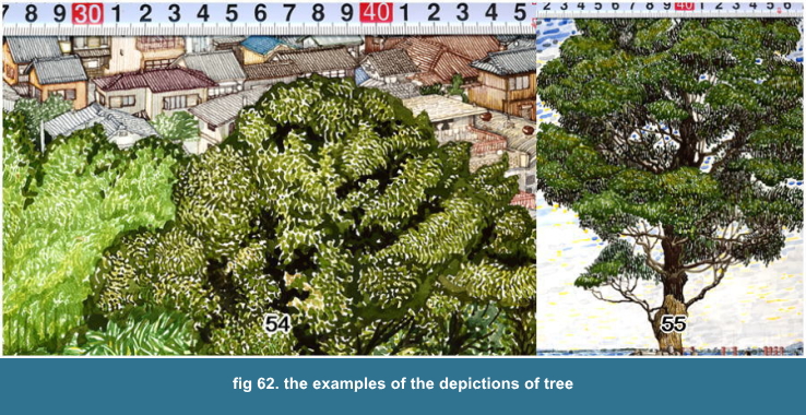
54. Landscape in Otsu No. 20 Jul. 14, 2001//strongly stylized expression,
brush
55. Landscape in Otsu No. 24 Oct. 20, 2001// strongly stylized expression, brush
Step 9-3-09-01. General tendancy about the depiction of tree
The works of Landscape in Kyoto & Osaka
are natural expression and the works of Landscape
in Otsu is stylized expression.
Step 9-3-09-02. about the depiction of tree in far distance
It is easy to depict. If it is a tree stands alone in far distance, then
we can see there just the leaves as a green figure surrounded by a contuor
and a trunk. So we just paint it as it appears.
If it is a tree in a mountain, then it is
nothing but to depict a mountain in middle
distance, that I had mentioned former.
Step 9-3-09-03. about the depiction of tree in middle to near distance
Here we need thinking and skill. For in these distance we can see each
leaf, if we closely look at it, at the same time we see the whole leaves
gathering. And we know as a knowledge that a tree is made up by a trunk
and limbs and leaves, the construction.
But we actually can neither distiguish one leaf by one leaf, nor correctly
arrange one leaf by one leaf. So what we can do here is to make feel the
existance of each leaf as the tangible quality of the whole leaves gathering
or as the condition of the surface of that.
That is the samething to the depiction of
mountain in middle distance. For the mountain,
the tangible quality means to depict each
tree.
For the tree, that means to depict each leaf.
If an object is an collectivity, then the
tangible quality or the condition of the
surface reflect the character of each part
that makes up the surface. It is a tree,
and a leaf.
The important thing is how one tree or one
leaf, each one part appears in the whole
body of the collectivity.
If you can depict one leaf by one leaf and
correctly collect its to the natural whole
body, then it is best, but you can't do it.
You can see the examples on fig 65-50, fig 61-52/53, fig 62-54/55.
fig 60-50 is the my first Watercolor Landscape in 1989, so it is very naive
and unexperienced but very fresh eye.
By the way, I had made two works about the
same subject, the drawing and watercolor
until Landscape in Kyoto No. 4. For the first
plan I wanted to express each subject by
the four medea, drawing by pencil, watercolor,
print and oil painting. Acturally what I
could have done are only watercolors, a few
drawings and a few prints.
I did't have enogh time except 1989 in these
12 years and I don't. I can say I couldn't
paint at all to earn a bit of money rather
than I say I have painted. But nobody knows
that. This is Japan. That's all.
Still I can say I had done something, if
I compare my works with a bunch of stupid
famous contemporary painters.
I think I have depicted naturally and faithfully a tree by dotting with
brush. fig 61-52
fig 61-53, fig 62-54/55, those are strongly stylized expression by rough
short lines or rough winding lines.
fig 59-49 was drawn in Apr., 1989 and fig 60-51 was painted in next year,
Apr., 1990 by the drawing 1989. I think it is exactly and precisely depicted
for an eye observing and free hand. In that distance, we can clearly see
the trunk, limbs, branches and even twings. And the limbs and branches
cast their shadow on their trunk and limbs. fig 60-51 Those shadows play
the very important role to make us feel the cubic impression. So you must
never omit its.
Step 9-3-09-04. about the depiction of tree in very near distance
fig 59-46 will be the biggest part as a tree for a Landscape. The examples
fig 59-47/48 are rather a portrait of a tree. You can't identify and distiquish
one leaf by one leaf for the example fig 59-46, but particially it for
fig 59-47/48. You can identify the trunk and limbs for both.
Actually I depicted faithfully the front leaves, one leaf by one leaf for
the example fig 59-48. As I painted the works of Landscape in Kyoto by
free hand, so the positions is slightly uncorrect, maybe.
I depicted each leaf as an ideal shape, or analogical shape as a knowledge
for the example fig 59-47, but I suppose you can see the each character
about each leaf in front for the example fig 59-48, because I depicted
faithfully those leaves as I observed.
I used to depict exactly what I can identify
and distinguish for those very near object
and fill up the left space, that is filled
up with what I can't identify and distinguish,
by the ideal or analogical shapes, or stylized
expression.
I depicted particially the leaves with small rectangles for the example
fig 59-46, but you can't see it by this photo, you will be able to see
the details on the another file.
You can see clearly and precisely the tangible
quality and the condition of surface about
the trunk and limbs. It is not so difficult
to depict those elements, for the elements
are enough big and clear and not changeable,
then only you do its as you see its. For
example, the skin of a Japanese cinnamon
is very rough and cracked, so you can sufficiently
express it by only to depict the cracked
skins with lines.

Step 9-3-10
he 3/12 examples of the depictions of other details
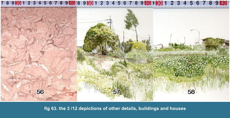
56. Landscape in Kyoto No. 5 Sep. 23, 1989 // natural expression, pencil & tempera white
57. Landscape in Kyoto No. 9 May 6, 1990 // natural expression, wash & brush
58. Landscape in Kyoto No. 13 Jul. 22 , 1990 // natural expression, wash & brush
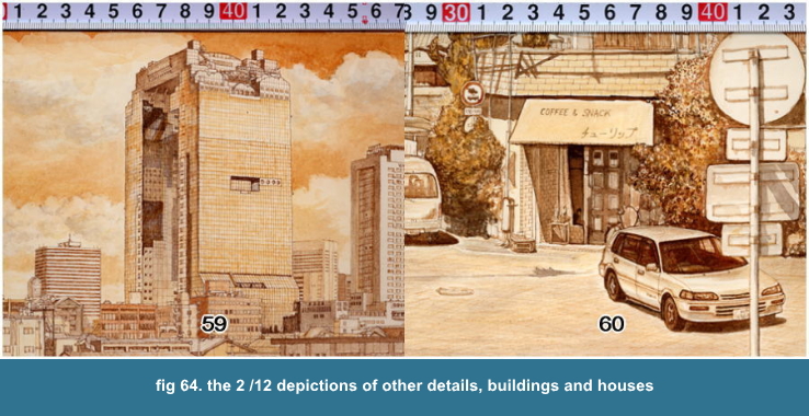
59. Landscape in Osak No. 5 Aug. 23 , 1993 // natural expression, pen & brush & wash
60. Landscape in Osaka No. 8 May 8, 1994 // natural expression, pen & brush & wash
about the depiction of buildings and houses and others
For buildings and houses or other structures
made by human are generally easy to depict,
becasue those are simple shape, geometrical
shape, and the texture, the condition of
surface is also simple or monotonous like
industrial goods, plastics product, so we
can sufficiently depict those by only contuor
lines.
Here, I proceed the explanation along each
example.
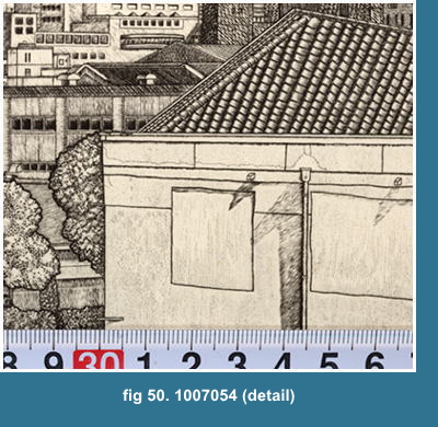
fig 64-56 is the detail of cabbage field. I depicted faithfully each cabbage
until I couldn't identify its. The interesting theme is, "Where is
the threshhold distance that divides the identifiable and the unidentifiable?"
Each line of furrows runs from the right hand bottom to the left hand top
at 30 degree angle. But I suppose you can't see it, for I didn't sufficiently
shadow them. You can see the dots, worm-eaten nearby the number "56"
fig 64-57/58 are the partial scene of weeds growing thick on a bank.
I think those look like a genuine Watercolor, though it's quite funny that
I say it by myself. Those are commonly used expression as a Watercolor.
Like putting drops, I applied watercolor with brush, then I applied abundantly
there water. the watercolor and water are naturally being mixed and make
"gradation" before those have dried.
That is a typical Watercolor effect.
Those two works are partially depicted, and
there remain many blank. The blank emphasizes
the Watercolor effect and its very free figures.
The blank and the painted part complete the
composition. But those expression aren't
suitable for
an exact and precise depiction for like my
Landscape.
fig 64-59 This is a skycraper. The number of windows are exact, unless
I miscounted it. I show it just an example. So I don't have anything to
mention.
You need to be carefull about the dimension of each floor hight, I mean that the hight of the highest floor may be smaller than
that of the ground floor by the perspective effect, especially for those skycraper. So you need to measure the hight in parts.
For example,
You measure the hight between the ground floor and 10th floor. the 1/10
value of the hight is the hight of each one floor to 10th floor. Then you
measure the hight between 10th floor to 20th. And the 1/10 value is the
hight of each one floor from the 11th floor to 20th, etc.
Acturally, you won't measure the hight between each 10 floor, but between
the characteristic details. If the skycraper has nothing but the same details
everywhere, then you will have trouble counting them, sometime forgot how
many windows you have counted to.
It is quite troublsome work, but easy, if you are patient.
Indeed the building is the landmark for the city. These skycraper, morden
architecture is beautiful in distant view. But nothing its have except
being high and big and the CONCEPT. Probably that skycraper won't be standing
there after a hundred years.
fig 64-60 This is the front door of small coffee shop's and cars. I think
the quality of the front window of the car is well depicted. I have depicted
an umbrella stand and a beer crate in front of the door. Compare two examples,
fig 64-59 and 58! You must never judge like this, "The skycraper is
new and huge and rich, so it's worth of depicting. And the coffee shop
is old and small and poor, so it's not worth of depicting" Here, in
art, the sense of business or general value helps nothing. That's important.
And, for these Landscape, the sense of common or snob ARTISTIC value helps
nothing as well.
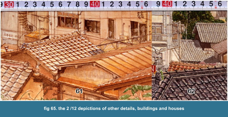
61. Landscape in Otsu No. 2 Jun. 23 , 1996 // natural expression, pen &
brush & wash
62. Landscape in Otsu No. 5 Aug. 17, 1997 // natural expression, pen & brush & wash

63. Landscape in Otsu No. 5 Aug. 17, 1997 // natural expression, pen & brush & wash
fig 65-61/62, fig 66-63 These are the depiction of roof tiles.
The number of the tiles is exact. I suppose you can distinguish the difference
of the tiles, especiall about fig 65-62 and fig 66-63. You can see the
contrast between the glossy black tile of fig 65-62 and the shadow of behind
roof tiles and grass grown on the roof. You can see the brown color roof
tiles and the scattered grey color roof tiles for fig 71-36 left-hand.
The roof is very old turned to brown and the grey roof tiles are newly
repaired. That speaks itself the history. The washings are hung on the
poles.
As you look at fig 65-62, I suppose you can feel the space, distance, depth,
or perspective by the perceivable changes about each size of roof tile,
though I have only measured each object and I want to be faithful about
the objects.
That appears the monotonous working and not
artistic at all for people just looking by
side who want to see, for a just their fun,
an artistic person furiously painting like
a inspired genius, having a good looking
for TV camera. If I could tell the truth
only to shout loudly, I had already done
it.
Some artists speak about a space "What
is a space?", another speak about a
realism "What is a realism?" like
Zen Questioning. As I listen their Sortful
speech, I can not help thinking those artists'
are usually ridiculous. They speak much,
somethings, but their work speak nothing.
They are just talking irrelevantly rather
than they are speaking to supplement what
their Visual expression can't tell.
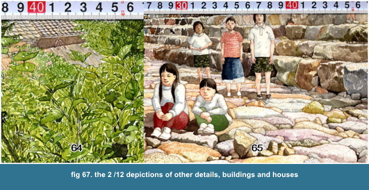
64. Landscape in Otsu No. 5 Aug. 23 , 1993 // natural expression, pen & brush & wash
65. Landscape in Otsu No. 14 Oct 11, 1999// natural expression, pen & brush & wash
64. Landscape in Osak No. 9 Jun. 6, 1994 // natural expression, pen & brush & wash
65. Landscape in Otsu No. 15 Jun. 10, 2000// natural expression, pen & brush & wash
fig 66-64 This is weeds.
Several stems and leaves in front are exactly depicted. The other spaces
are filled with the pattern by Brush Touch.
fig 66-64 This is the bank protected by fieldstones.
Except the upper left side, the stones are exactly depicted. I expressed
the texture, quality of the surface of the stones by short lines with pen,
and coloring partially and shadowing them with "wash" For a stone,
the depicting by pen is quick and efficient. You can express it much more
naturally by dotting with brush. Then you need much more time to finish,
because you have to handling constantly the point of brush, and to dot
many times with rather light watercolor until to get the natural tone.
By the way, to depict a child is difficult,
for a child is never sitting only for 5 minutes,
similar to a dog and cat.
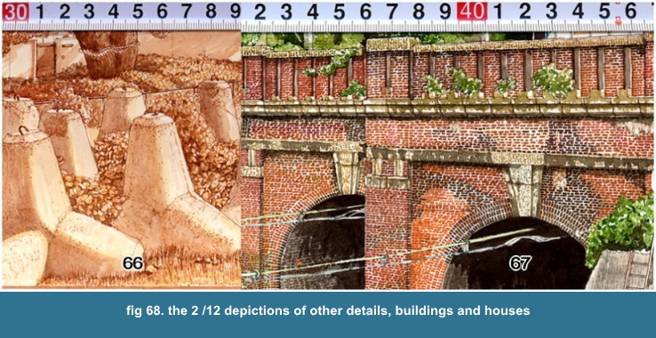
fig 68-66 This is tetrapods and weeds
fig 68-67 Those are the old brick tunnels.
The tunnels are slightly converging by perspective. I depicted each brick
by a calligraphic pen, 1.5 mm width. I can't freely change the width, so
the space between each brich is getting narrow from the right-hand to the
left, acturally, I drew from the left to right. The white is the material
white, paper. I gave "wash" partically, for I thought it too
whity. The number of brick of the upperest layer is exact but the others
aren't.
I think I have sufficiently explained about
3rd element, or more than needed.
Now there remains the finish of the sky and
the finish of the works.

Step 9-3-11
he finish of the sky
Please reference the former about the depiction of the sky!
The brightness of the sky changes definitely
the impression of the painting, the whole
brightness. And to finish the sky is the
most free and delightful thing for a Landscape
painting. So I recommend to finish the sky
as the lastest process. When I have finished
the sky, I really feel as I have done it
completely.
Step 9-3-11-1. about the brightness of the whole impression
Basically, if you darken the sky, then you feel the other part became brighter,
especially the high-lighted object, as if the light concentrated on that
object.
Step 9-3-11-2. about the composition of blue sky and white clouds
I love the bright blue sky and bulky white clouds. Those are usually the
high-contrast. If you have painted the complicated and rich detailed landscape,
then it is difficult to successfully combine the high-contrast sky and
the landscape. For the high-contrast sky sometimes diverts the attention
from the elaborated details.
I point out two combinations below, indeed
it may be easy solution, I think too.
1. the high-contrasted or complicatedly composed
sky and the simple landscape
2. the monotone sky and the complicated landscape
Of course those are the alternative problem
which part, sky or landscape, you stress
on. That means there is the another solution
worth of trying to successfully combine both.
Basically, to depict and finish the sky is
also to observe the nature and reproduce
faithfully it. So if you have enough time
waiting in several days the sky that you
want to depict, then you should wait and
finish the sky. I think you would get something,
like the atomosphere, or the liveliness,
if you have done it by faithful observation,
even though you couldn't successfully reproduce
it. Artificial expression is nothng more
than the artificial, never matches to the
observation, however it is neaty.

Step 10
INISH
I usually give "wash" and often use Yellow, like Gamboge and
Cadmium Yellow or Orange to reduce the whity impression and to stress the
out-line of objects and to give a nuance. (Gamboge is transparent material
and Cadmium Yellow and Orange is opaque)
To give "wash" is to adjust the
wholely brightness and impression and to
give the unity of color balance. As I have
been depicting the details with pen until
the finish, here I boldly and roughly wash
with a rather wider brush.
To stop the wash, the timing is very difficult,
but you have to stop it definitely.
You can't change or make infinitely your work better even though you are
infinitely painting in right proceedure.
Because a changing by touching up is gradually reducing smaller as to getting
nearer to the finish, that means you need too much labour for that effect,
being lower efficiency.
As I am steadily completing my painting a bit by a bit, a detail by a detail,
so I wouldn't completely fail by a detail, instead of that, when I have
filled up my painting with details, then my painting has naturally determined
the whole impression that I can't give a noticeable change by adding a
detail and colors but a nuance.
If you can't be contented with your finished work, you should think clearly
what you can't do with and reflect that to your next work. Never get to
change it! It's quite useless labour. You can't infinitely getting nearer
to the integration even if you are infinitely painting like a Leonard da
Vinci.
When you have filled up your painting with
detail, then you adjust the whole impression
and stop it. That is the FINISH of one of
your work.
I should proceed the further explanation about each work. And to explain
much more than what I have explained to here, is just confuse the whole
idear about this file, I think, so I should also stop it like above mentioned
FINISH and start next.
Lastly, I say about my method.
I believe everyone can paint like me, if he or she try and endevour it.
And I suppose you can understand that you can do it if you do by my method,
and you think it easy.
But you won't be able to do it at all only to read my method, if you don't
try it at all.
There is possibility, as far as you really try it.
But you need the reason or passion or disposition to do and please it.
That is the main reason to hinder you from trying it, if you didn't, I think.
If you try it, then you will be able to understand really what it is.
My method was devised to exactly reproduce what I was seeing.
So if you can't find any reason to exactly reproduce, then my method is
nothing for you.
I don't think at all that it is only art to reproduce the sight.
I don't think at all that a realism painting is only art.
But if you want to exactly reproduce what you are seeing, you need to contrive your method and my method may be helpful or indispensable to discover your own way.
Above all my method about the measuring is
much more reasonable for a painter in field
than any other method or instrument that
have been ever contrived.
By my method, a painter doesn't need to copy a photo in his room, and to paint in open air is much more delightful thing than any other work.
And the desire to exactly and precisely reproduce the nature or what a
painter is seeing, is very simple and natural desire that every painter
has once felt and has been existing since acient time, probably a painter
had ever started to paint.
I suppose we have once felt that, if we have once painted, even though
a camera has been wide spread and usually we used it to record something.
My method is one of solution to realize those
simple and natural desire as a painter without
depending upon a mechine, without being a
slave to a machine, not secondarily through
a translater, what we call a camera, but
directly from nature that you are facing
and you are in.
If you have clearly recognized your desire, what you want to do, and that
was to paint exactly a landscape, my method would help you.
But, generally, I think we don't know clearly what we want to do, and we
need much more time to know that.
It was 1990, then I was painting Landscape in Kyoto No. 18 on the road
along Katsura River. I remember it clearly. A coupl, husband and wife came
side by me and were looking at me painting. I think that watercolor isn't
well but they said they liked it.
So I said them "Everyone can paint so much as this, try youself it
!, Please."
Several days later, on Suturday or Sunday, when I passed on my bicycle
by them, I found them painting not so far on that road. They were standing
and painting side by side to their canvas on the easel. Those were oil
paintings and the motives seemed a house and trees. Their material, easel
and the set of oil painting tubes seemed all newly bought.
I thought their paintings, the house were too big for the framing and settled
on the center. Their painting were already, or almost finished and the
whole impression of the color was the raw Viridian.
Simply say it, those were an adult child-painting, they were too adult to freely paint by the conceptual knowledges that
they had gotten, at the same time their conceptual knowledges prevent them from finding out on their object no more than their conceptual knowledges.
Neither they were free from the objects, nor they were faithful to the objects.
They were standing and painting, so why did
they have the standing position?
They choiced an Oil Painting, so why did
they have it?
They were painting a house and trees, so
why did they have such composition?
I think they couldn't reply to my questions
at all, why they had those choices.
I knew it since I told that to them. I said only humblly it, humblly, of
course humblly not to them, but to a painting.
I suppose they really thought by my suggestion that they had been fun, if they had been able to paint like me and anyone could paint so much as me.
They thought it would be fun, and they only knew it, I think.
That is the raw desire to do something.
But they didn't know that something, or this something, that is probably the same thing as the adolescent desire that everyone had once had.
We need not to reply every question, "why?", I think too.
And we will happen to encounter what we want to do, even we don't know what we want to do, I suppose.
We would sometimes order, "Please something taste good!"
And we would know it at once really good, or bad, even we don't know how
it is until we eat it.
If we have that desire and the tasting, and
I think everyone has actually those two things,
then we may need the intermediate, medium,
to exactly communicate between that desire
and the tasting.
That, intermediate, medium, is art.
We can combine irrelevantly and at random that desire and the tasting without
examining those two things' nature.
Then we don't need the reason. ( and we do intentionaly it, as one method, Chance Operation. In this case, to combine two things by happening is only clear matter.)
More definitely our desire and tasting we
know, naturally more preciser and exacter
the intermediate, medium becomes. That is
a general tendancy.
That desire, that tasting are never to be developing their nature, their
contents, as long as they combine that desire and that tasting without
any reason.
We don't need always to be able to explain
their reason, that explainability is quite
another thing, I think too, for we possibly
do it with any reason that we don't have
as the written words but our behaviour, still
there might be any reason.
We don't have the given desire and the given tasting from the begining
but we are finding out our desire and tasting developing as we are making
up something by our activity as the name, art, the expression, the medium
that communicates and combines that desire and that tasting.
Namely, there isn't the prepared right answer
or absolute last answer, art, the expression
that makes us always obidient, that we must
always submit to without any condition, that
independently exist to our desire and tasting.
As those three elements closely communicate one another, it is much more important thing that you have to be careful to each element.
As far as your are careful, you will find out your desire and tasting on
the medium, nature, surroundings, your art, what its were, and that will
makes you finding further research about your desire and tasting. If you
are careless about your desire, tasting and the medium, and merely painting
by the given style, you can't find anything about your painting, then there
isn't further research.
Realism or Abstrcat or Others, whatsoever
the category of intermediate is, the intermediate,
expression will be developing by itself its
state from the raw desire, as long as the
three elements communicte one another.
That is nothing but that we find "Ourselves
developing and shaping by ourselves' activity"
on the intermediate.
What we will find will depend on what we have found, so that may have been
a different result even for same person. That means Realism or Abstract
or Others. The important thing is to find, to find something, you have
to be careful, am I wrong?
Realism painting, exactly saying it, Painting
baseed on careful observation and faithful
depiction, make you known clearly how careful
you are. If you are faithful to observing,
Nature is the best teacher.
If you could do well Realism, you can do well Abstract and Others too.
On the first and last trip to Eourope in 1991, their old cities gave me
the impression. I felt vaguely I need to have a techniqe to paint their
Cities, and that means immedieately to precisely and exactly depict the
buildings and houses.
That was put into the shape as one suite and one method, that are Landscape in Osaka and my method of measuring.
What I want to explain on this file is an idea and a process how to depict
and build up an image and why I did so.
That is also my own qestion, when I see the old master drawings and paintings and prints.
If I learnt only their each expressions, that was the action only to copy
the typical expression, though that might be enough for a professional
painter whose main purpose is to earn money.
And I can suppose my watercolors might give the impression as an artisan.
But if you had that impression, that is wrong, however my elaborated details might give that like an old realism painting expression.
Because my watercolors, my expressions are the result of my thought. I have learnt a lots of things from the old masters,
but I have never only copied them once, but guessed and learnt them thought.
So my watercolors, my works may represent
something new, thought, attitude, and that
have a completeness of a style as a drawing
and painting and prints, I think.
THE END
Jun. 11, 2002

I have writen and been writing about my actual process of my painting,
Documentary Process.
Those are the records of my daily work.
I think you will understand clearly the process of the painting by the
documantary process. This fike, method, that I have written about the essence
and thought, so if you want to know the actual process, then, 'Please see
its!'.
And I have written the supplementary explain about the documentary process
1 below. If you are interested in that explain, Please read this after
you have read the documentary process 1.

P.S. The supplementary explain about the documentary process 1 Landscape in Otsu No. 25.
I explain supplementary the process. By the another point of view, the
summery process is below.
1. the determination of the lay-out by the
mesuring
2. the partial depiction by drawing
3. the partial depiction by coloring
After you have finished the lay-out ( the
process 1), you repeat only the process 2
and 3 by turns and are finishing a part by
a part until you have painted the whole.
As the lighting condition is very important for coloring, and I choiced
the lighting condition as the fine day, 12:00 to 14:00, so I have to be
doing mainly the coloring on that condition and the time and the drawing
on the other. Because I can proceed the depiction by the drawing in any
time without that condition.
Why am I finishing a part by a part?
Because I depict much more precisely the details. You can't do it after
rough painting like an ARTIST.
Even If you are going to finish your watercolor by full colors and do faithfully
the coloring, you can never use the whole time of the painting for coloring
but just the partial time like former mentioned the condition, the fine
day, 12:00 to 14:00.
I have enough experiences of the watercolor painting, so I can do such
process.
However the process was the result of demand, this process is very effective
usage of time.
And there is the limitation, problem of the watercolor material. I say it again.
The watercolor material can't cover the color on the under layer as gouashe,
acrylic color, oil painting material. You can't paint your picture brighter
but only darker with watercolor material. So you can't depict the high
light details on the once roughly coloring part.
If you want to finish your watercolor by monochorme tone, you need not finish a part by a part.
You can do much more quickly the shadowing after you have finished the whole depiction by drawing. It is quite delightful.
But the full color expression needs the patient process.
I needed 87 hours for the finish as you see the documentary process 1.
The size of my watercolor is 330x510mm. If you see me painting, I suppose
you think that I am quite slow to paint.
But on the contrary of that impression, I am rather fast. As you see, I
don't fail to paint, of couse I take a little, or a just partial mistake
that would be passed over, but I never fail the whole.
I am very steady on that point of view.
It won't be slow to paint as I don't be painting like an ARTIST's furiously
creation. My paint will be finished continuosly and regularly in the same
interval, if I have time.
It is only that I depict much more precisely the details. Only being fast
is nothing.
newly lay-outed, revised, expanded on May 10, 2003 END

Postscript 2022.03.07
Serial No. 5003079 Landscape in Otsu No. 68D 2007.09.21 pencil drawing
Serial No. 5003084 Landscape in Otsu No. 68W 2007.11.15 watercolor
I posted the last work by this method which were drawn and painted 5 years after this writing.
This is my solution of which I had still had the problem about the treatment of color when I had written this writing in 2002.
It was the happiest time in all my life as an artist that I had whole four years from 2004 to 2007, every May to December,
I went out every day to paint landscape by my mother’s support. I spent every whole year for my art.
She was running her small family business, Sento, Japanese public bath by herself.
She was doing it everything alone, except the cleaning of the bath house. It was the end of 2007 that she told to me, “I can’t do it alone anymore. So stay in home!”
She was 84 years old. I was 52 old. I stopped it next year 2008. I found something wrong on my right eye in this year 2008 May,
and I had been able to see nothing but the white-out through my right eye by Cataract until the end of the year.
I had the operation January 2009.
I heard sometimes she was talking to herself “I do it as far as I can?” She did as she said. She lost her right leg by Thrombosis three years later since then in 2011 February.
She had been able to do nothing without help. I had been caring her. Isa Sugita, she died in September 2019 (1923-2019), she was 96 years old, I was 64 old.
So this has been the last my work as a landscape painting in open air. Especially the coloring of Sky, Sea and Mountain were quickly done,
for probably about 30 minutes in a fine day in lucid air with the help of the characteristic of watercolor.
It has passed 20 years since this writing was done. I think now it that I could be so enthusiastic about the landscape painting, my art, because she was living. I was happy, I wanted nothing but to paint every day.
By the opportunity to replace and revise old files on the new layout files since 2007, I added the short essay above.
2022.03.07 Masaaki Sugita